

بيرفيكتو كوفي
-
About the Project:
- ### Introduction:
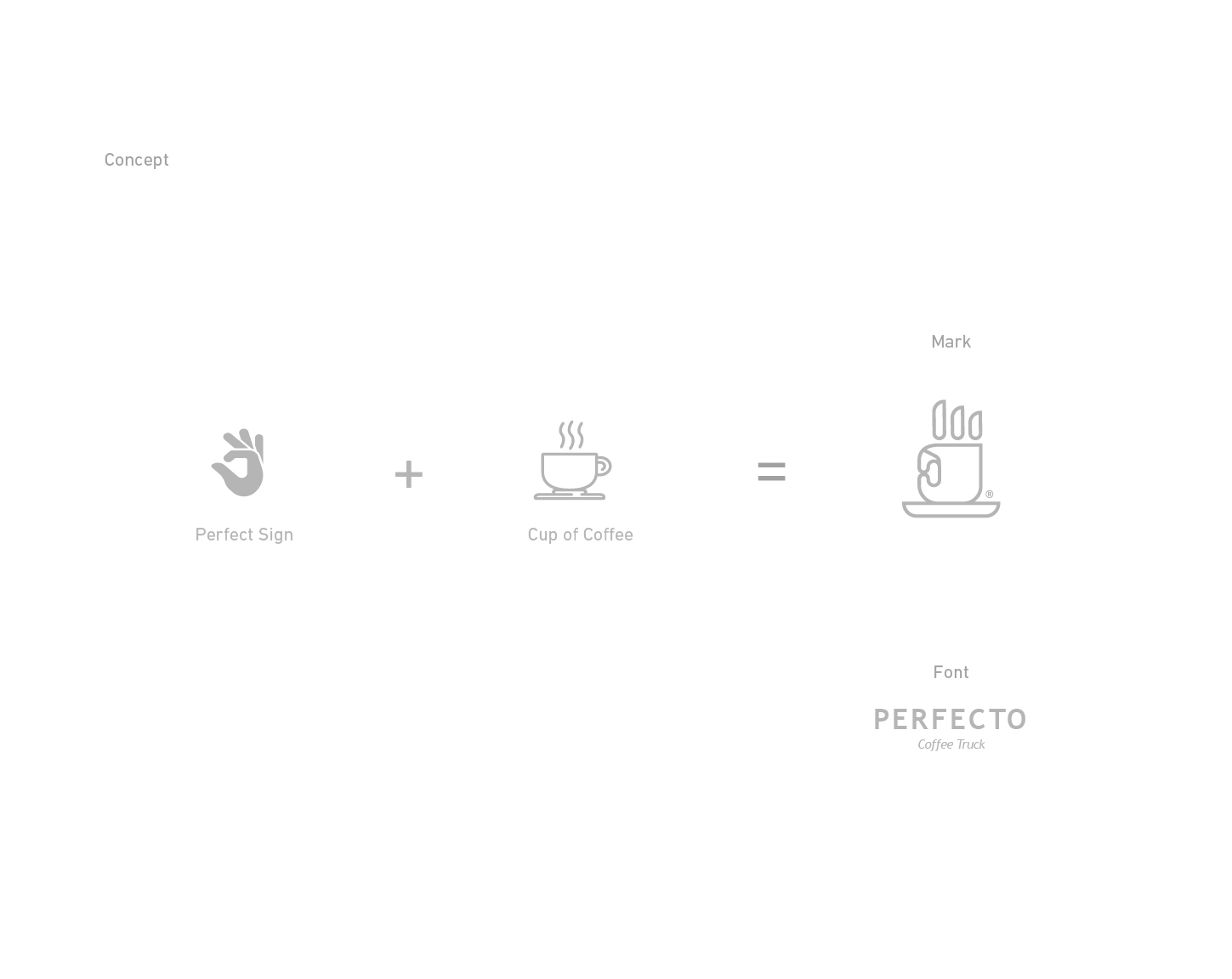
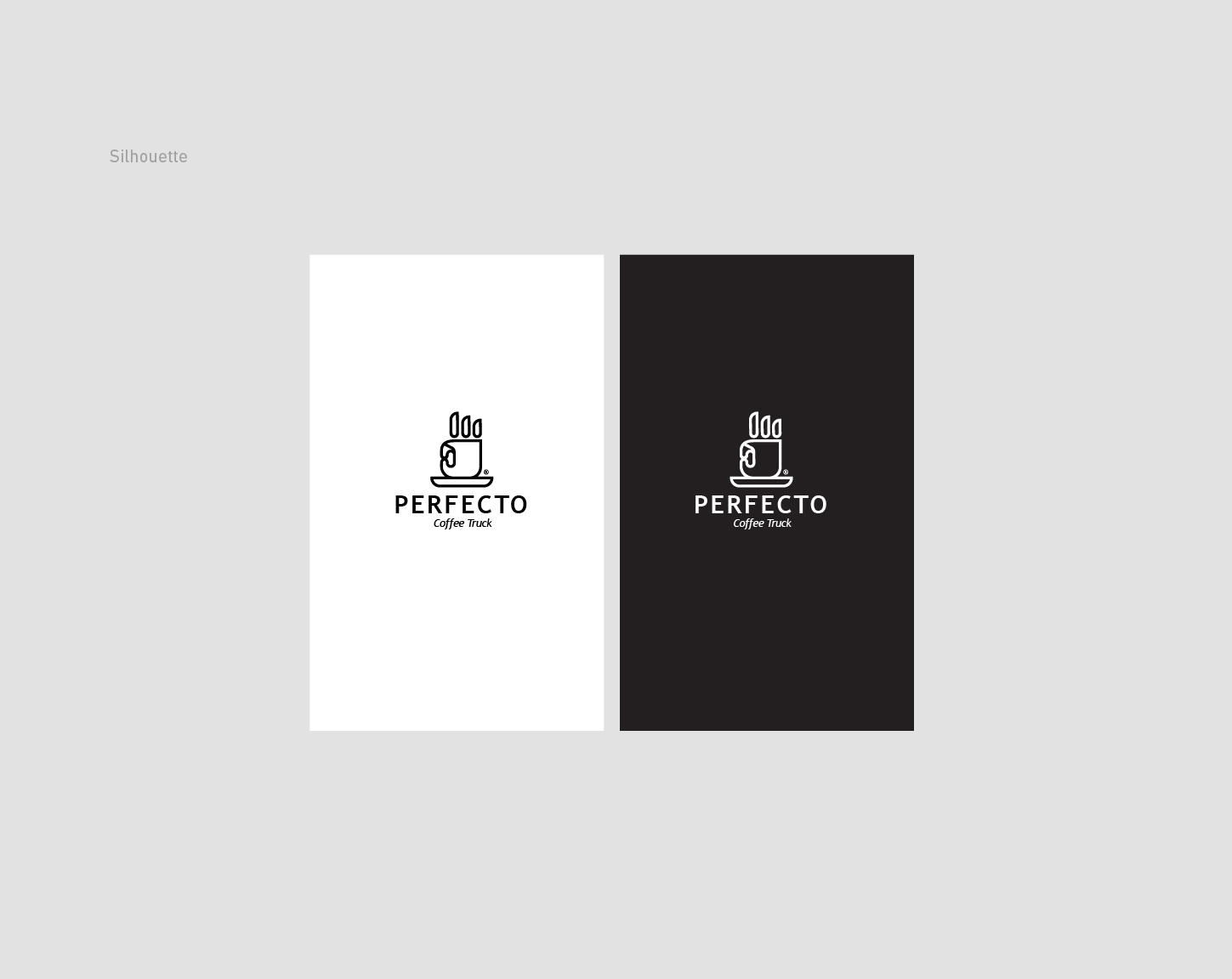
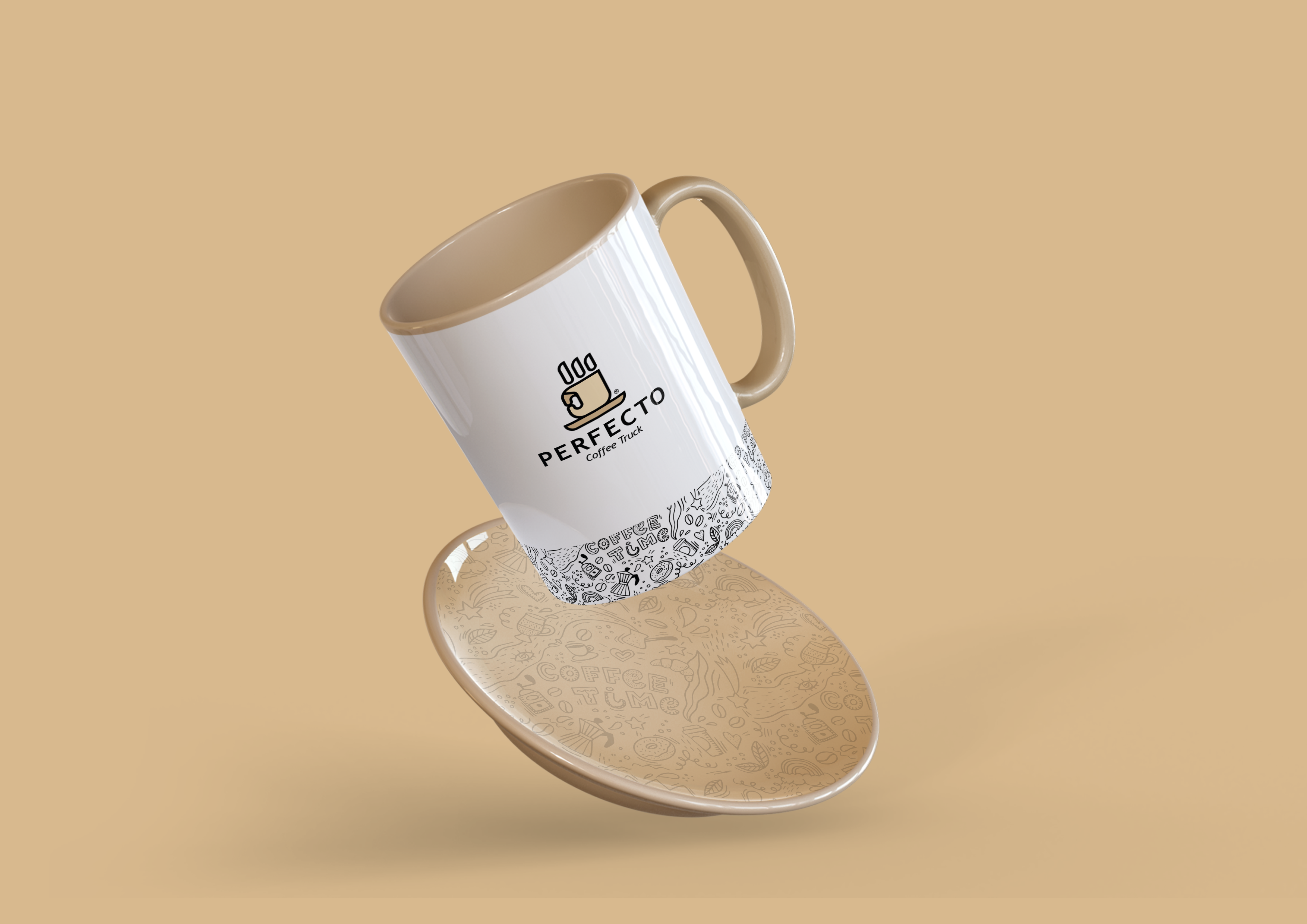
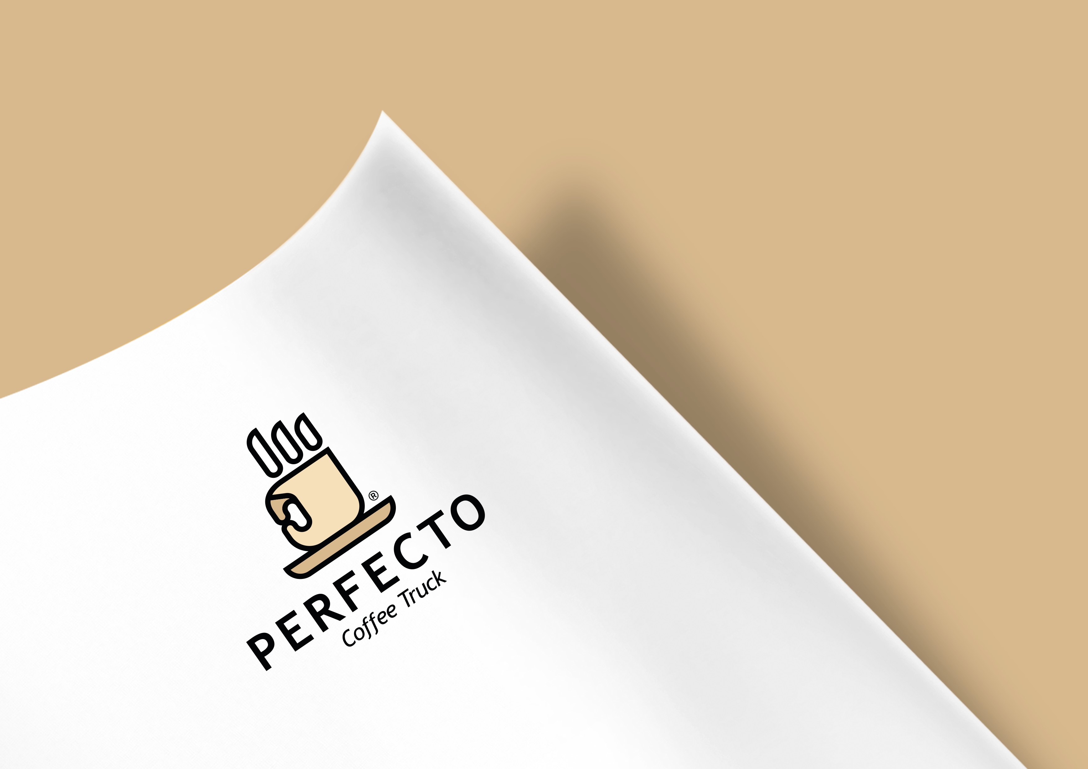
- In its pursuit of providing a unique experience for its customers, **Perfecto Coffee** collaborated with **REVINN** to develop a distinctive logo and visual identity that reflects the café's values. The logo of **Perfecto Coffee** embodies the concepts of satisfaction and perfection through an innovative design that features a coffee cup shaped like a hand, symbolizing movement and interaction.
- ### Methodology:
- The design process began with identifying the key elements that reflect the philosophy of **Perfecto Coffee**, which focuses on delivering high-quality coffee with attention to detail. We held brainstorming sessions with the café team to explore ideas that embody satisfaction and perfection.
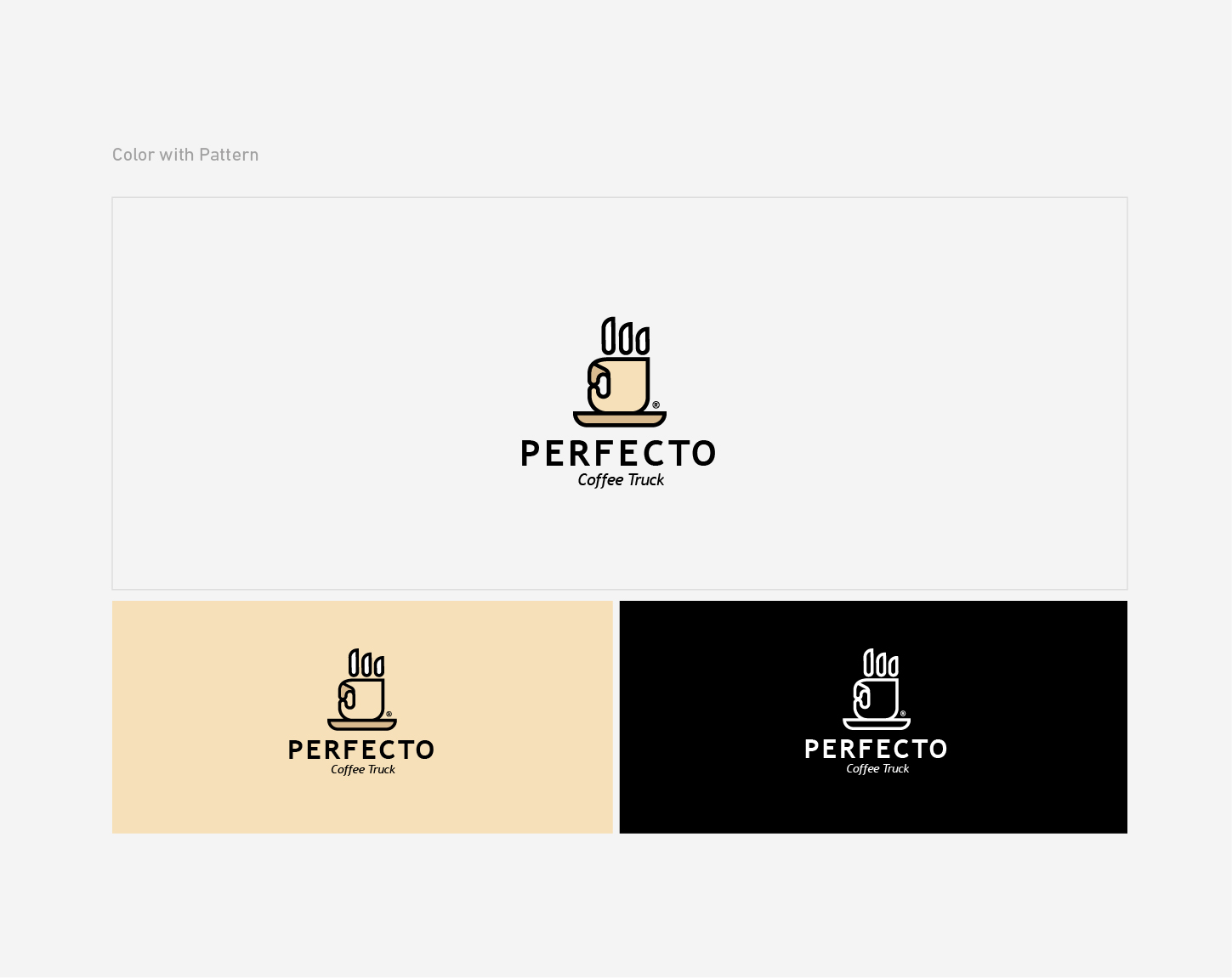
- We then moved on to the design phase, where we created several logo concepts that captured the idea of perfection. We decided to use the image of a coffee cup shaped like a hand, as the hand represents movement and interaction, symbolizing the provision of outstanding service and customer satisfaction. Warm colors were chosen to reflect the cozy atmosphere of the café.
- Subsequently, the final logo design was presented to the café team, and the design was refined based on their feedback.
- ### Results:
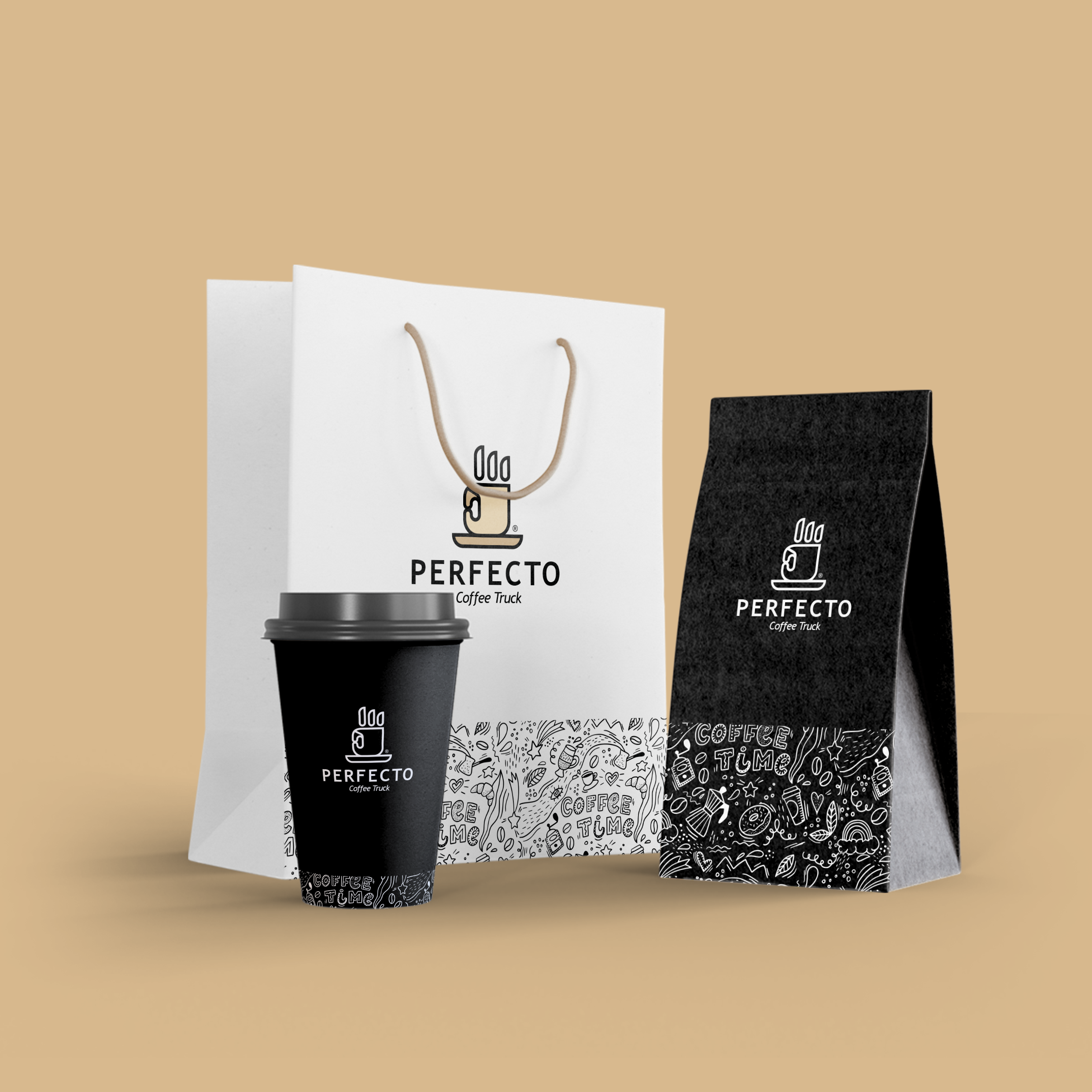
- The project resulted in a unique and distinctive logo that reflects the essence of **Perfecto Coffee**. The cup designed in the shape of a hand has become a symbol of satisfaction and perfection, attracting significant customer attention. The new visual identity has strengthened the café's presence in the market and contributed to increased visits and customer loyalty, making them feel like part of a special and unique experience.
More projects
View all projects
Have a project in mind?
Tell us about your brand and we will design its identity with the same care.
Launch your project