

Educational center for children
-
About the Project:
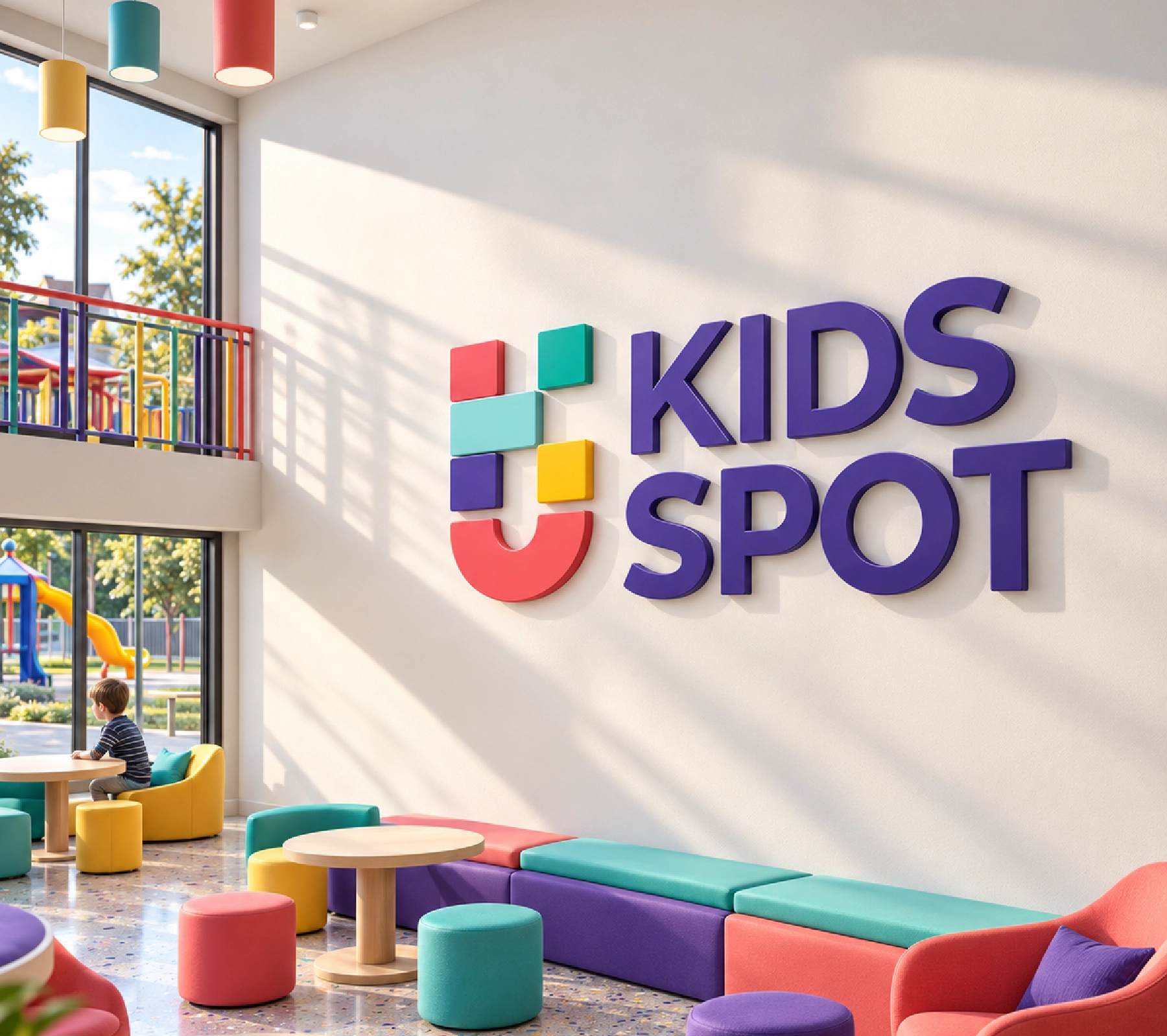
- At REVINN, we set out to create a distinctive visual identity for KIDS SPOT, a children's educational center inspired by the world of discovery, creativity, and learning. Our goal was to develop a brand identity that combines fun and education while reflecting the center's mission to provide a safe, engaging, and stimulating learning environment for children.
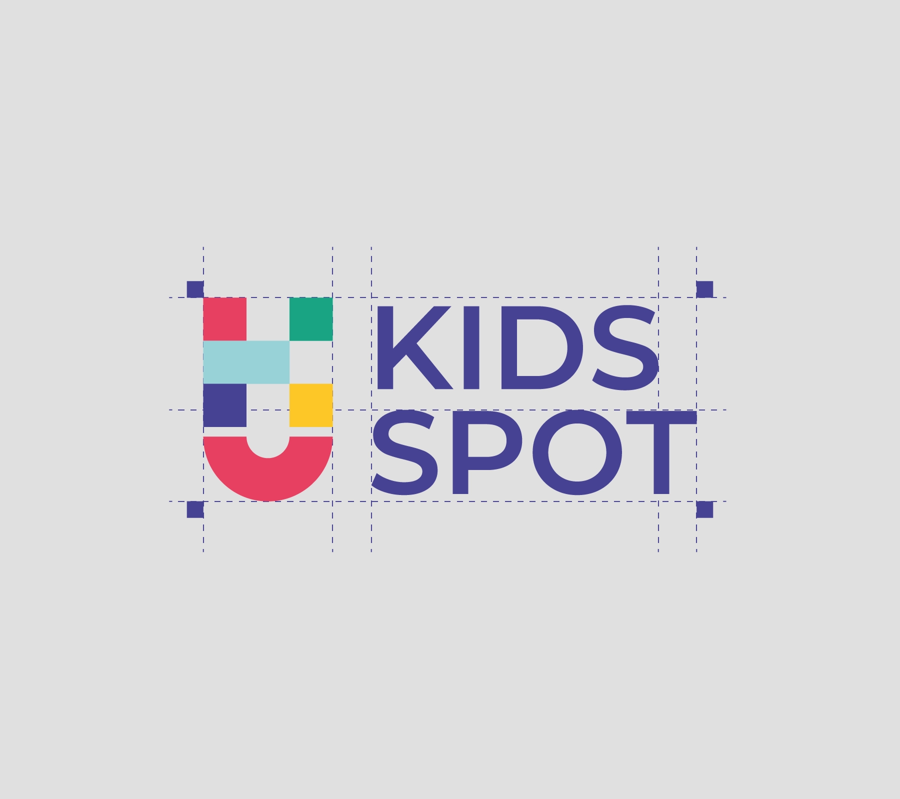
- The logo concept was inspired by building blocks and educational toys, incorporating colorful geometric shapes to create a unique symbol that represents simplicity, movement, creativity, and playfulness.
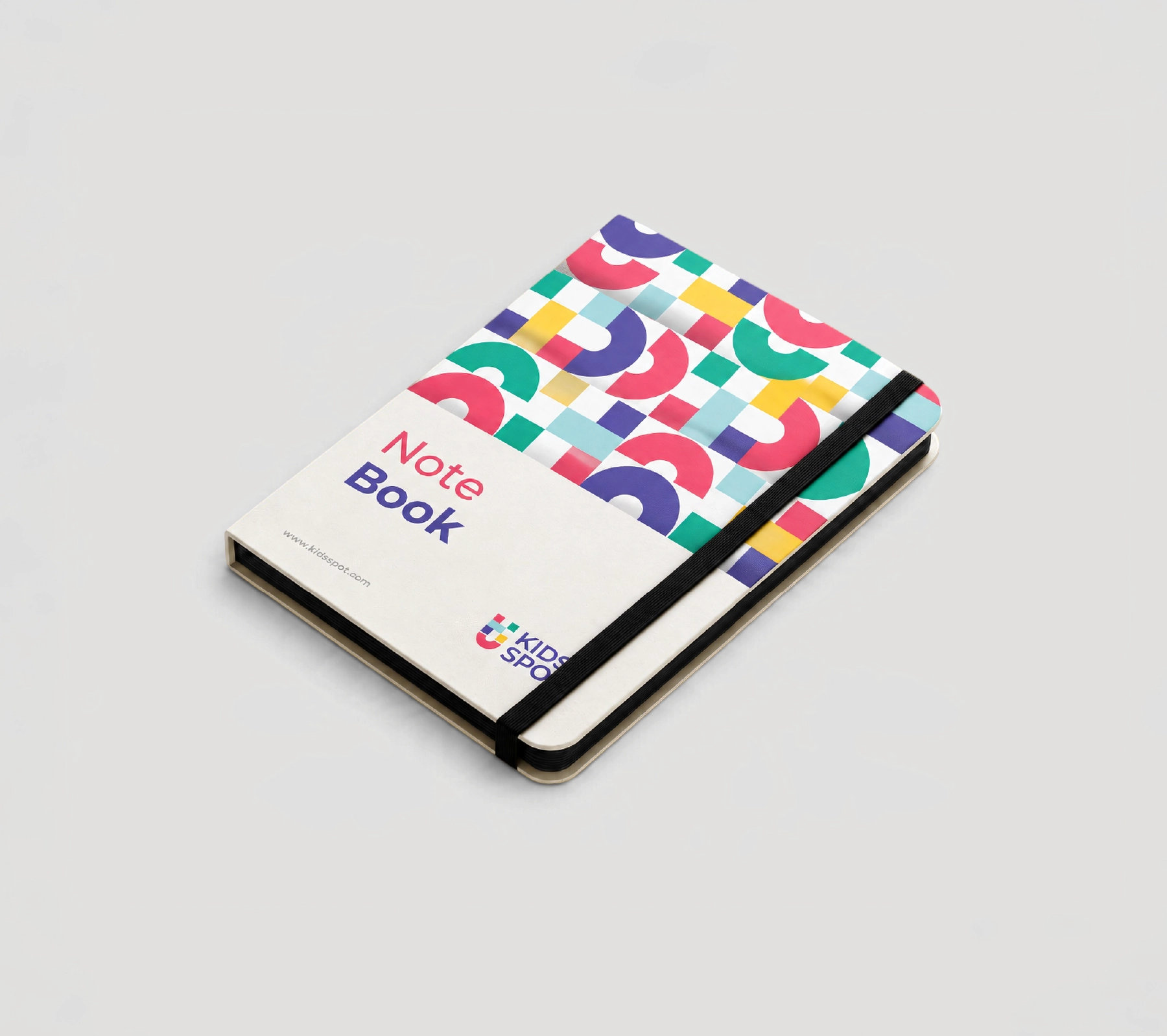
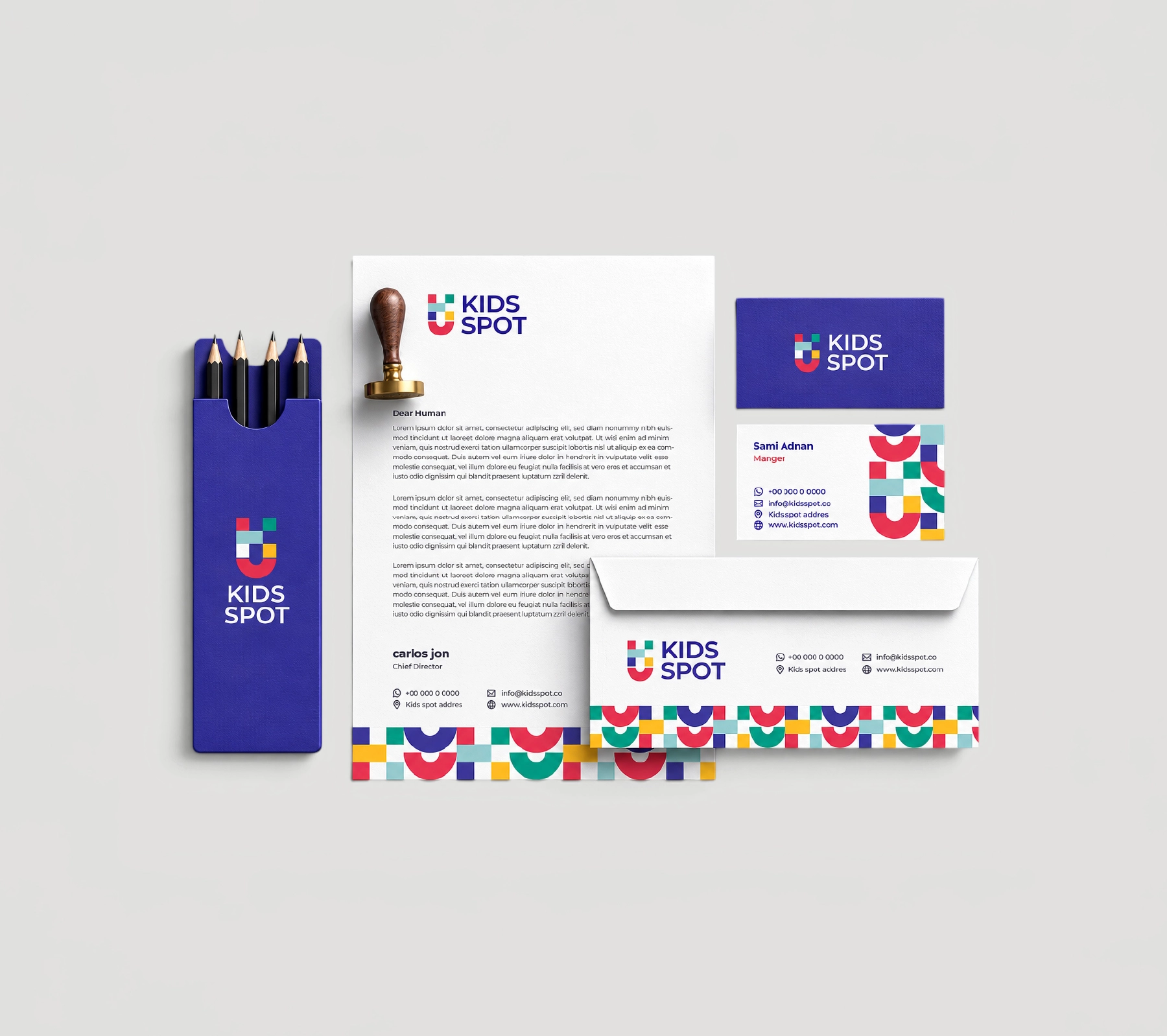
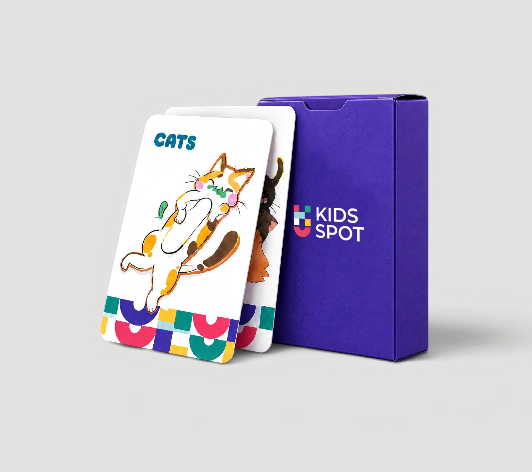
- We selected a vibrant color palette featuring purple, red, green, blue, and yellow to communicate diversity, positive energy, and the joyful spirit of childhood. Modern, clean typography was carefully integrated with a dynamic visual pattern derived from the logo elements, establishing a cohesive identity that could be seamlessly applied across printed materials, educational products, merchandise, and interior spaces.
- The result is a modern and distinctive visual identity for KIDS SPOT, successfully balancing educational values with a playful and engaging character.
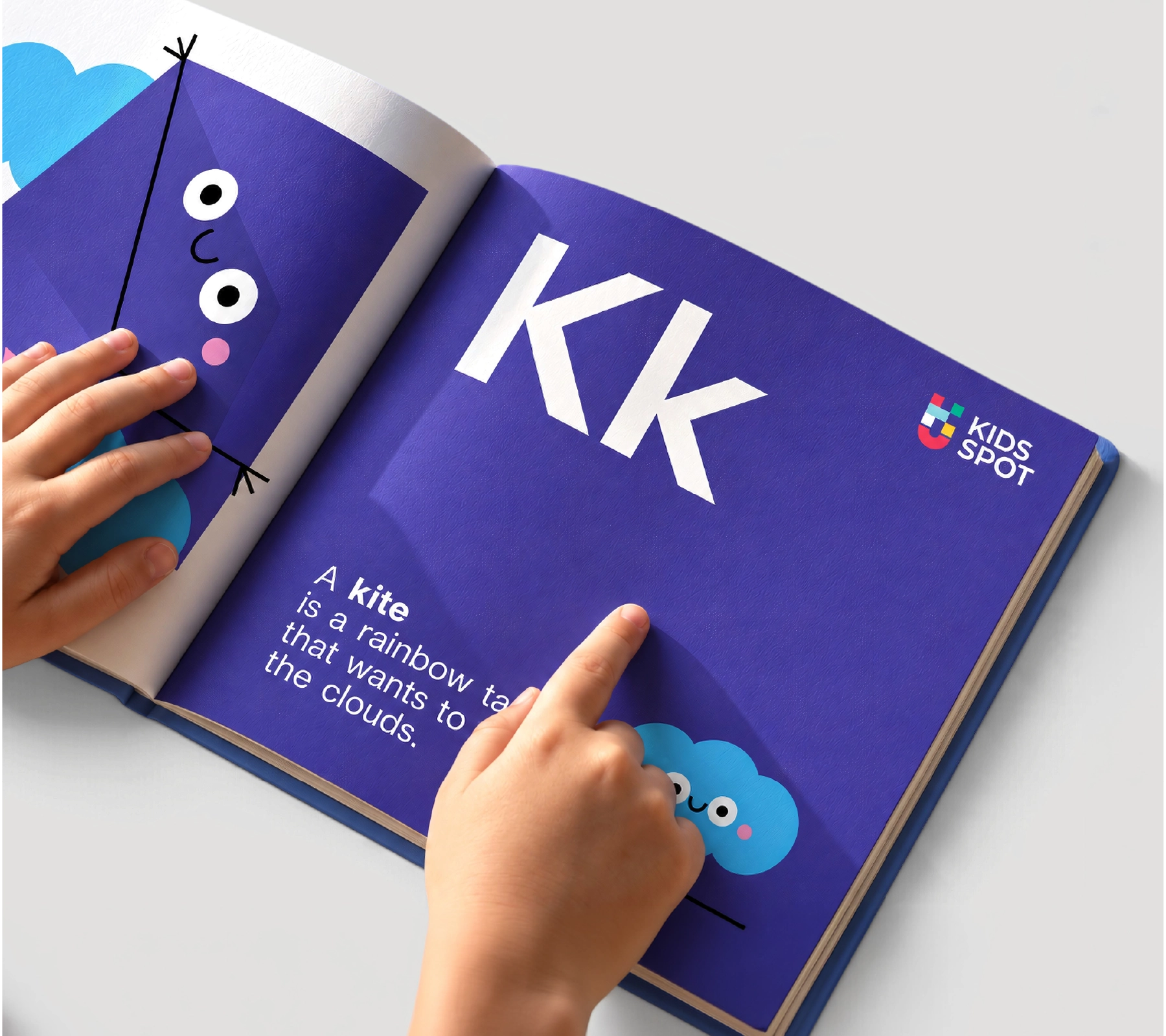
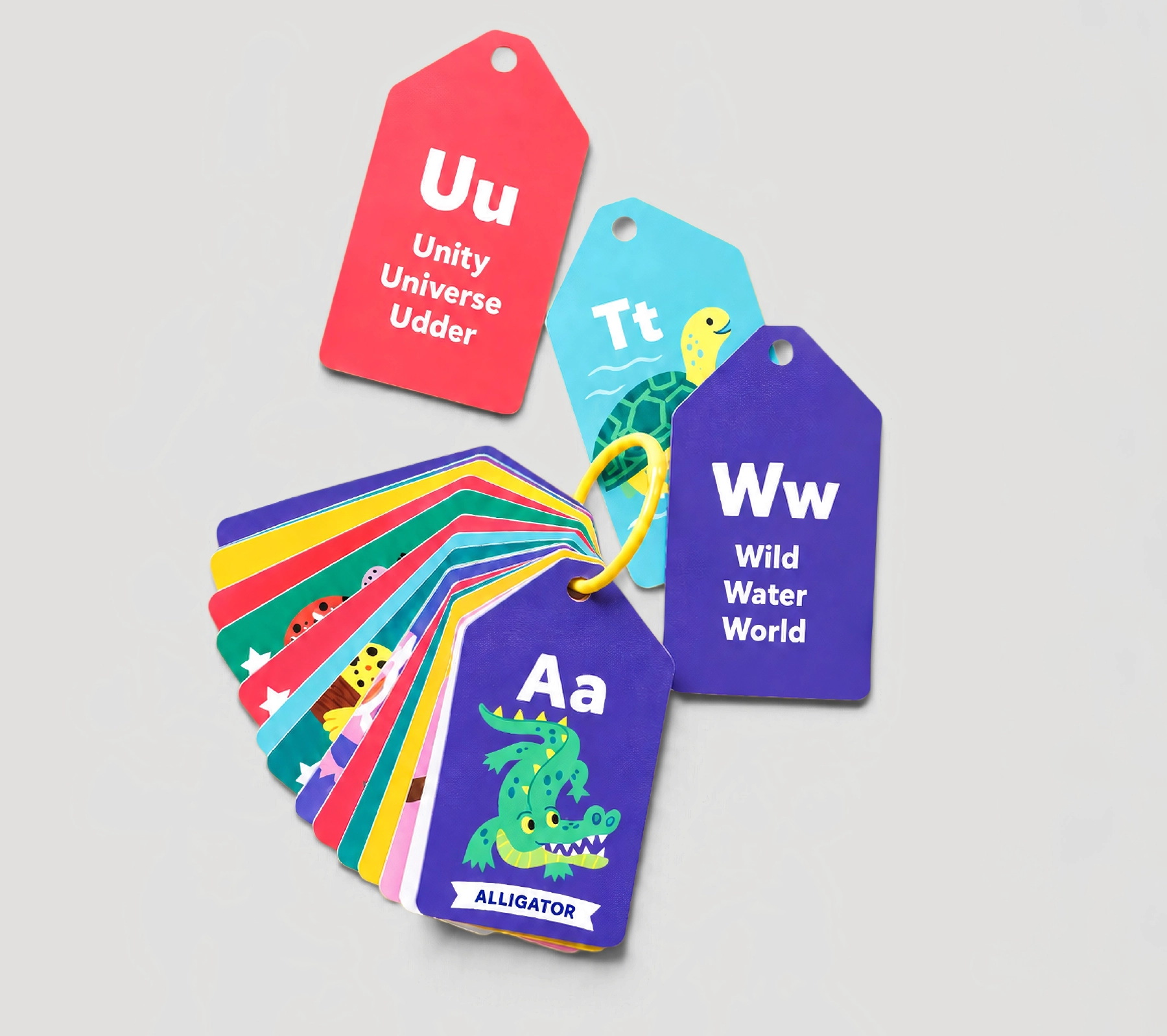
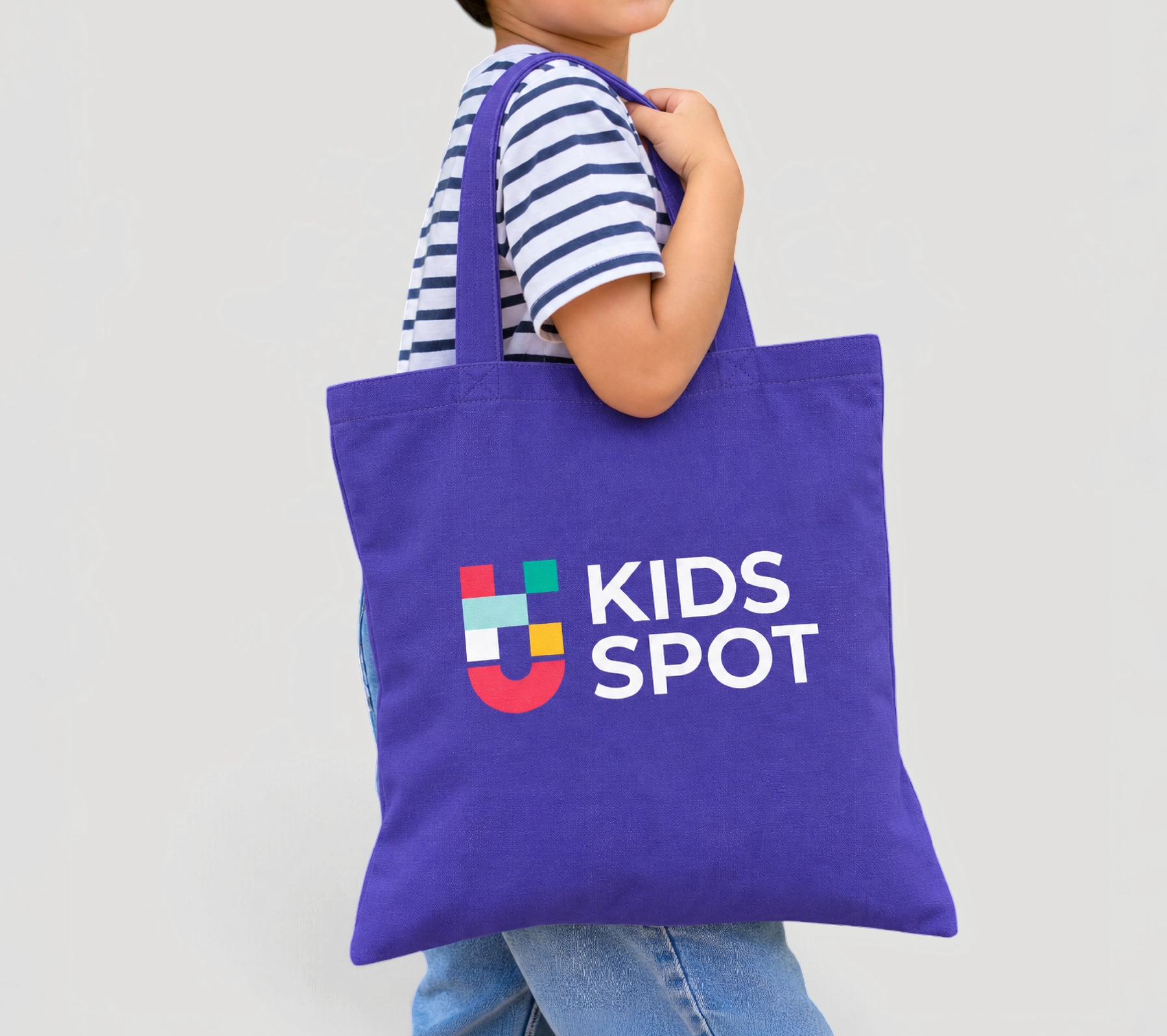
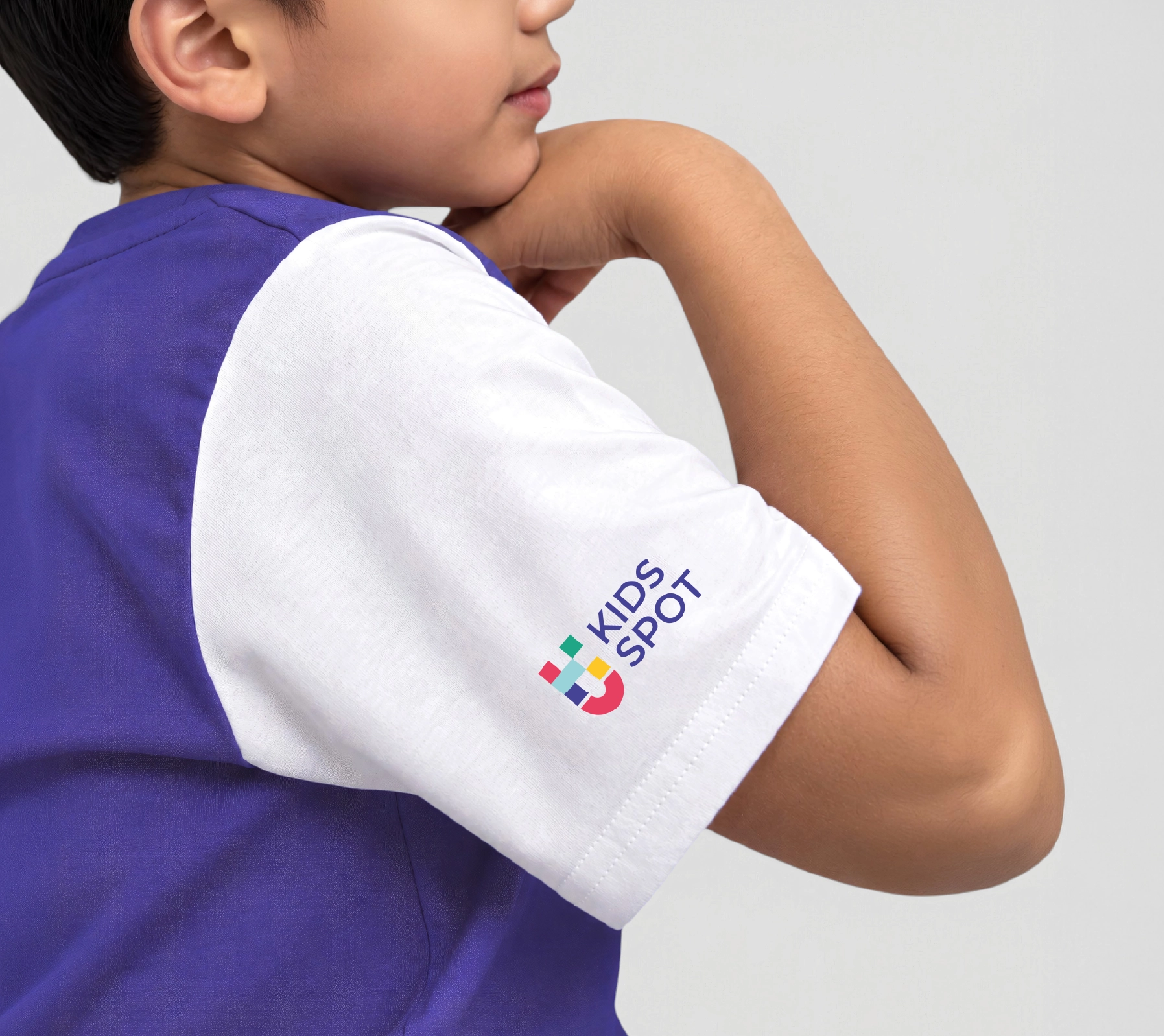
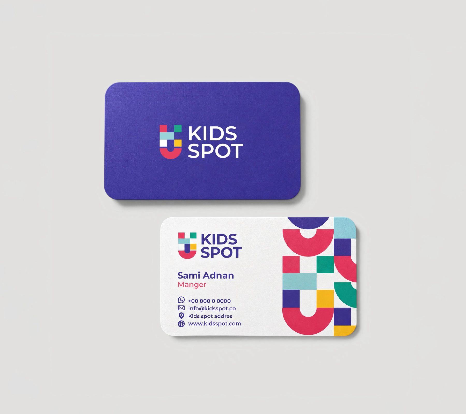
- The identity was extended across stationery, educational flashcards, notebooks, tote bags, uniforms, and interior signage, creating a consistent and recognizable brand experience for both children and parents.
- Explore some of the brand identity applications in the attached images.
More projects
View all projects
Have a project in mind?
Tell us about your brand and we will design its identity with the same care.
Launch your project